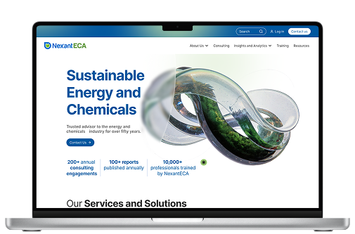
NexantECA
Providing technical, commercial, and economic analysis for the energy, chemical, and sustainable fuels industries.
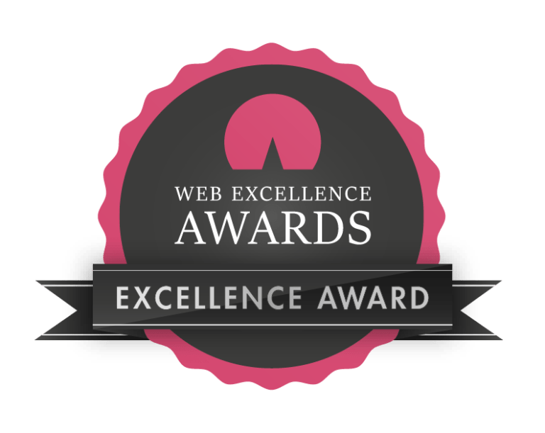 2026 Global Web Excellence Awards Winner - Best Professional Services Website


Problem Statement
The old NexantECA website presented valuable research and consultancy services but suffered from poor navigation, inconsistent branding, an outdated visual identity and was highly cluttered. Stakeholder surveys revealed key frustrations:
- Difficulty prioritising user journeys due to cumbersome content
- Lack of clear messaging for diverse audiences
- Visual design that did not reflect NexantECA's position as a global energy leader.
The challenge was to declutter and modernise the platform in a way that clarified the site's complex information hierarchy, to align with strategic and brand goals, and deliver an improved experience for multiple user groups, from energy consultants to corporate clients.
The Process
Empathise
User interviews
and surveys
Define
Current weaknesses and suggested improvements to website structure and content organisation
Ideate
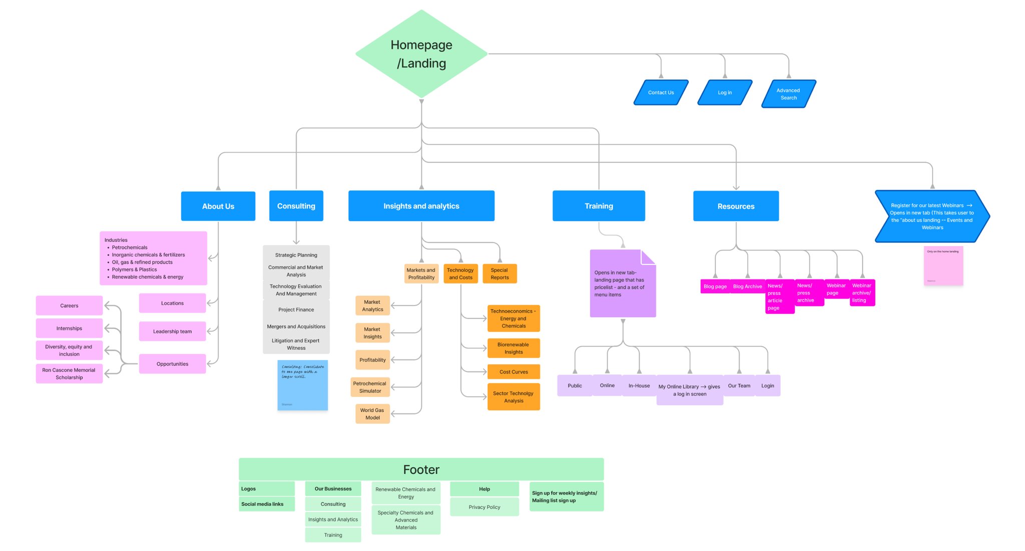
Rebuild site map,
brand refresh,
and brand imagery
Design
Design system
and site design
Empathise
Survey and Interview Responses
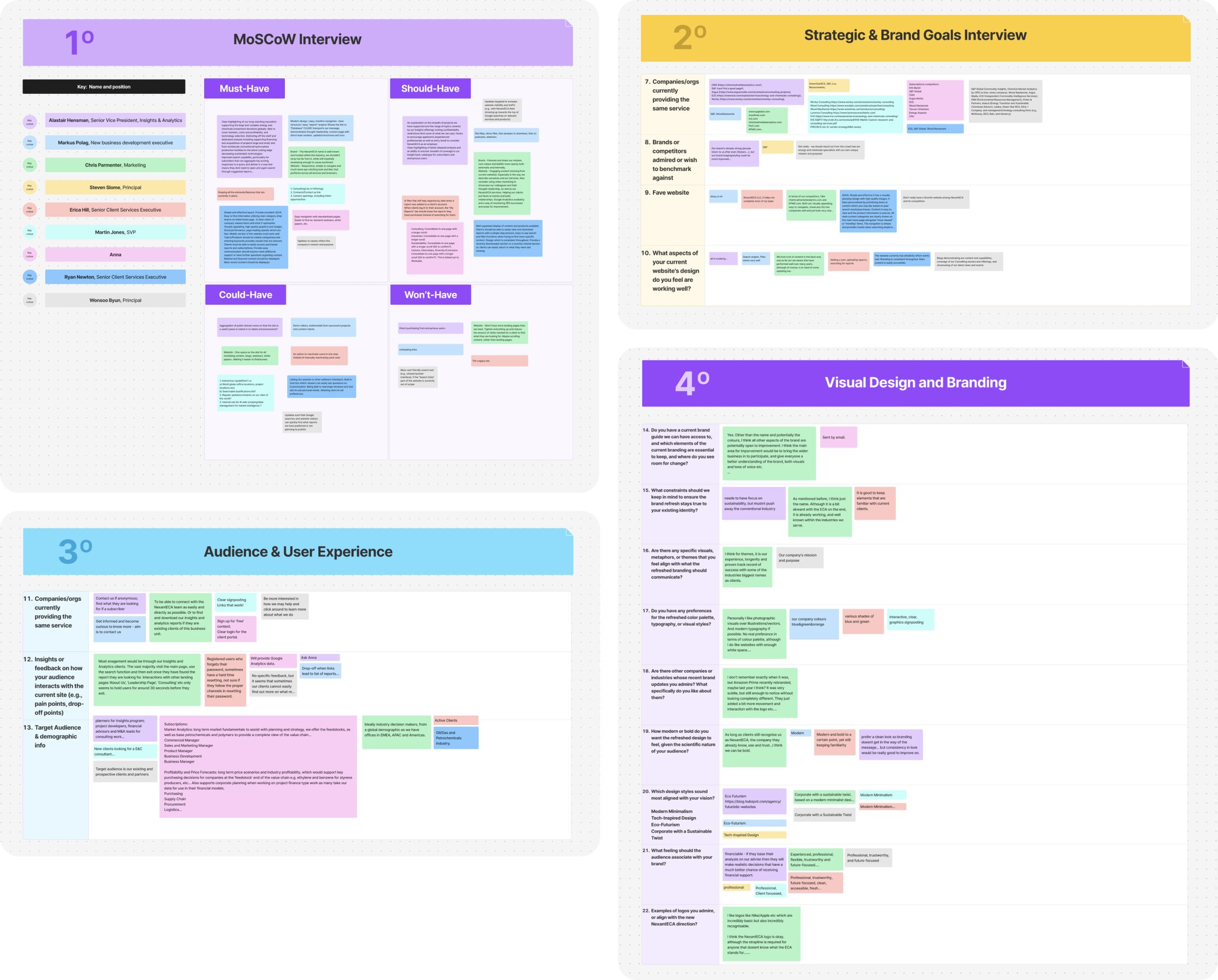
Key Takeaways
MoSCoW
The team wants a cleaner structure, improved usability, and content discoverability, but without losing familiarity for existing clients.
Strategic and Brand Goals
The redesign should reinforce authority and clarity, while elevating the brand to compete with major energy and consulting platforms.
Audience and User Experience
The redesign must optimise search journeys, reduce friction, and prioritise fast access to insights for both new and existing clients.
Visual Design and Branding
They want a refreshed, modern identity that signals sustainability as well as their expertise and innovation without losing trust or credibility.
Define
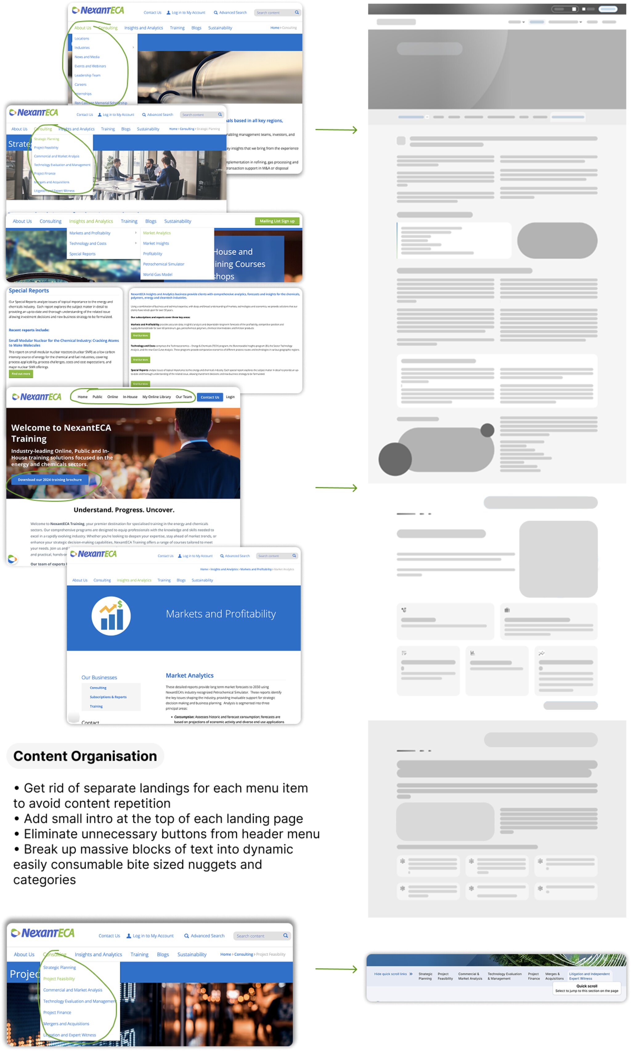
Current Weaknesses and Suggested Improvements
Website Structure
- Consolidate consulting to one page with a longer scroll
- Group careers and internships under opportunities
- Group "what we do/services" under consulting, insights and analytics, training, and sustainability
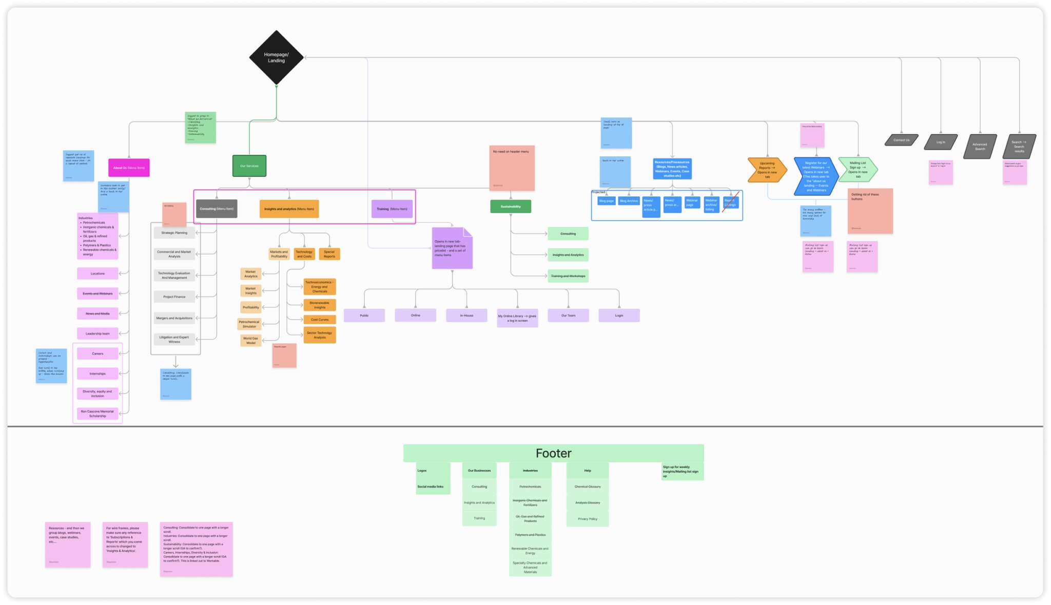
User Interface
- Introduce tabs for easy section navigation and a "back to top" action
- Reduce the number of buttons for better user experience and hierarchy
- Change "log in to my account" to simply "Log in"
Ideate
Improved Site Map
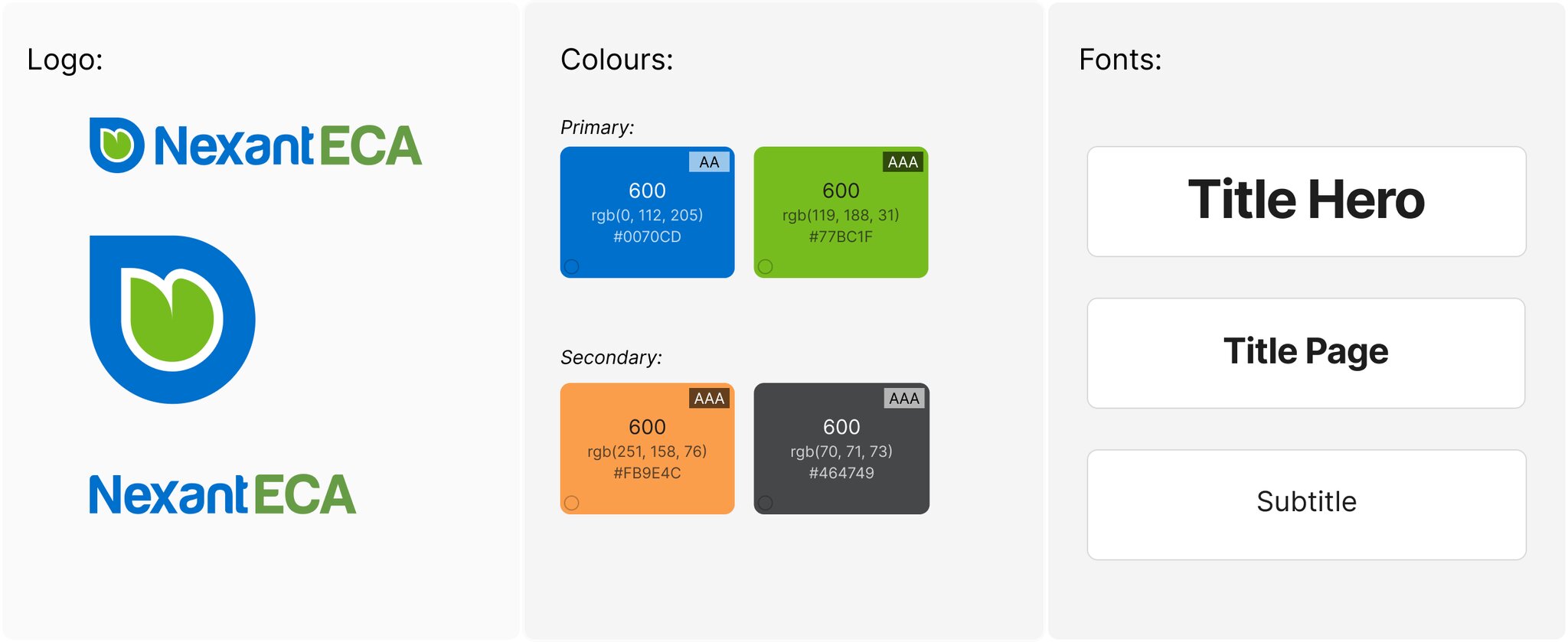
Basic Brand Refresh
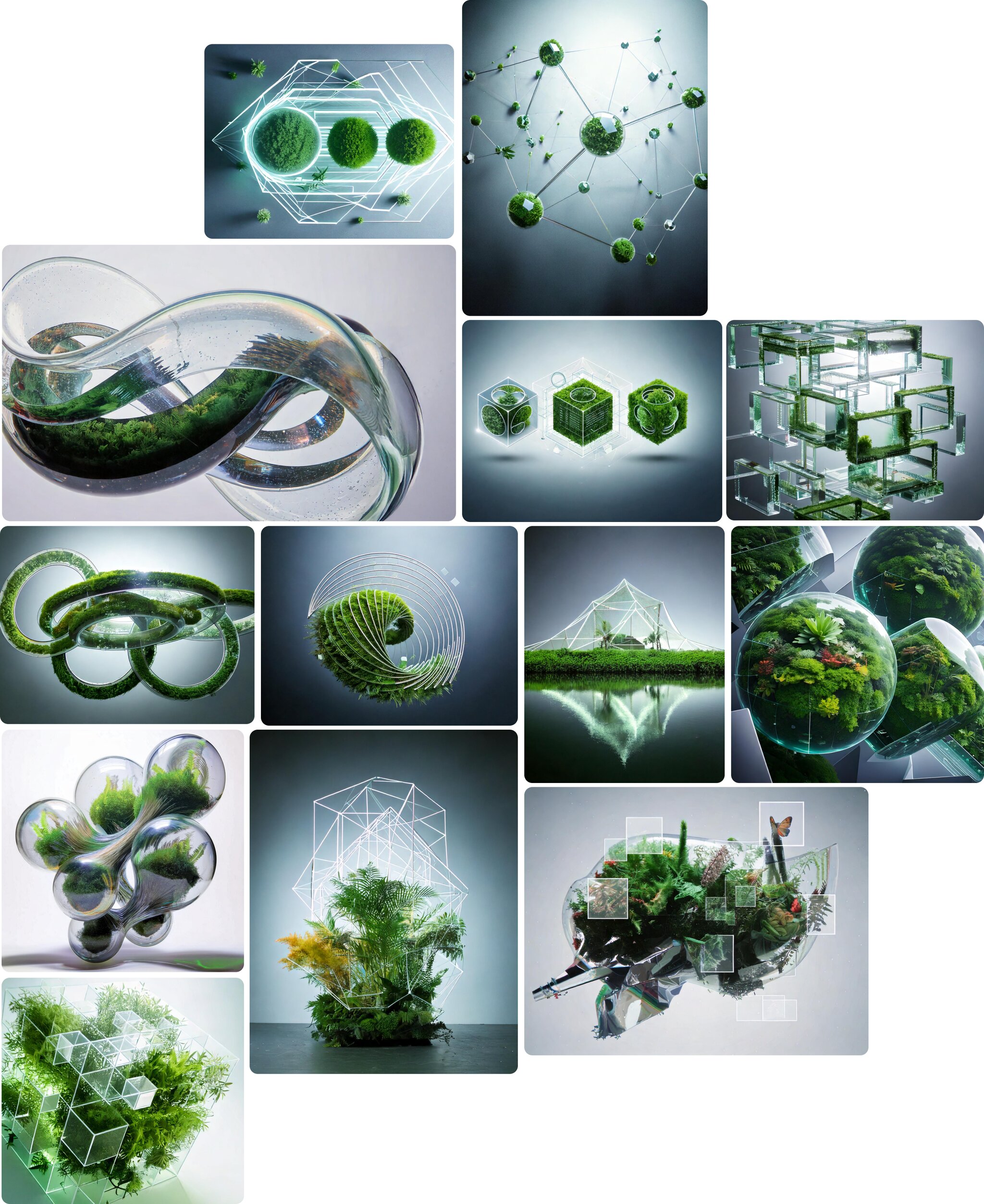
Brand Imagery
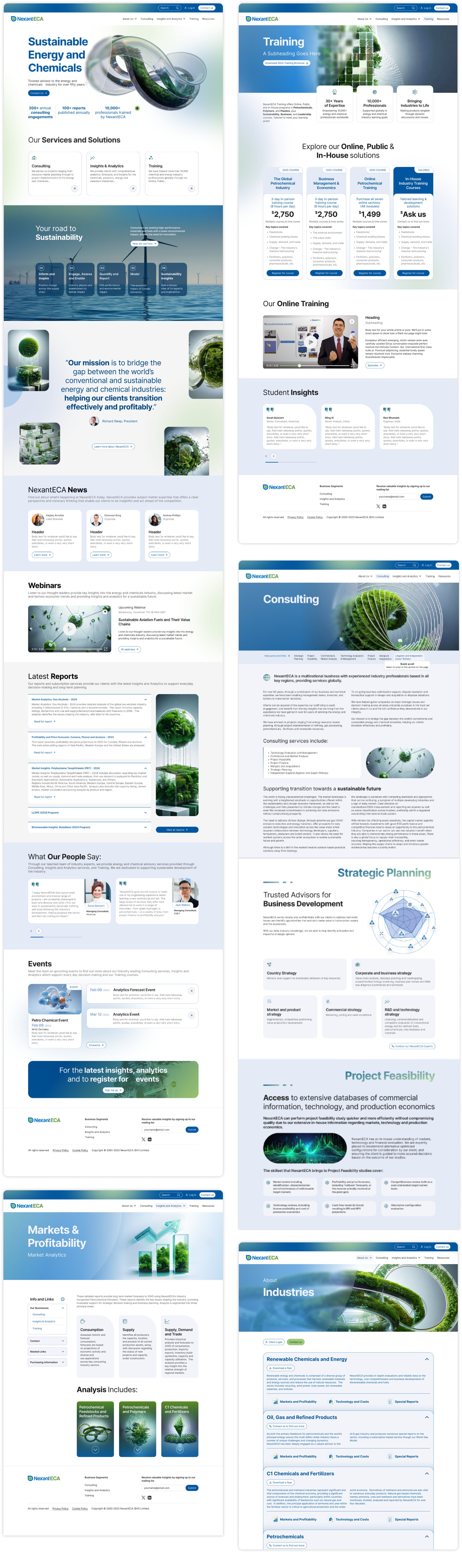
We created a visual style called ‘eco-futurism’ inspired by science and sustainability. We used AI and photo compositing methods to blend images of terrariums, rainforests, molecular structures, solar panels, hardware, software, and other machinery. This unique and striking style with a slightly sci-fi futuristic feel symbolises the the brand’s shift into the future, becoming a forerunner in the field of truly sustainable energy.
Design
Design System
Foundations:
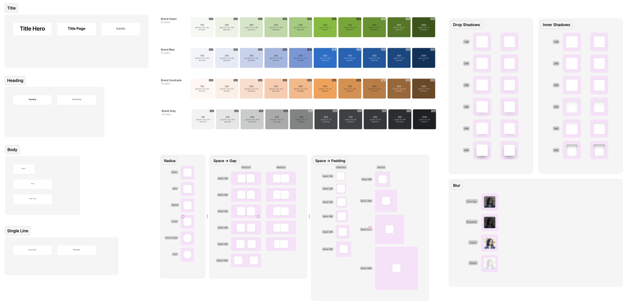
Icons:
Components:
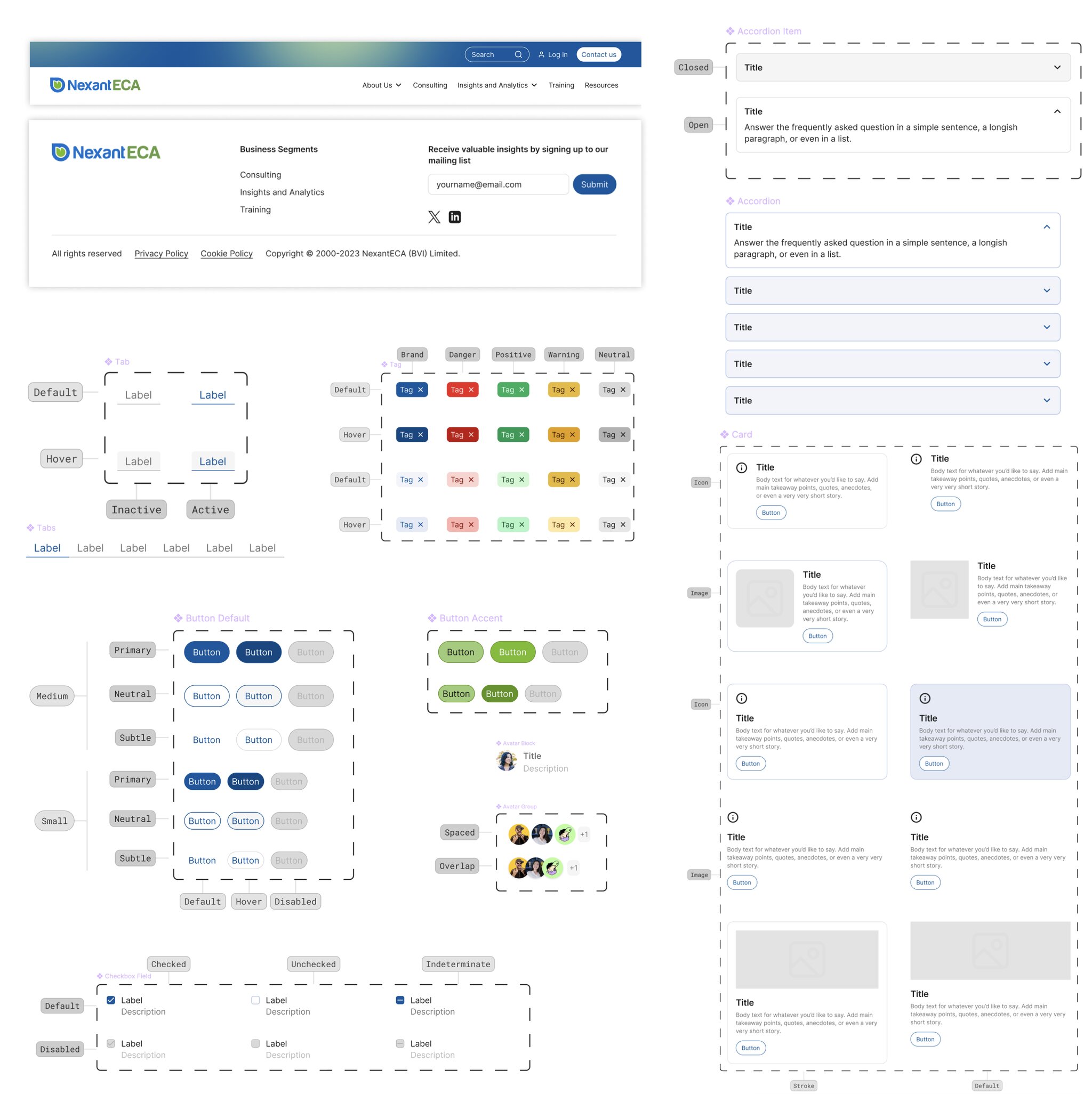
Custom Page Creation
Copyright ©2026 All rights reserved | NERD